Skip to the case study
Back to work
Jupiter app icon

Building MySpace: A customizable money hub that drives engagement

Jupiter.Money is an 🇮🇳 Indian fintech and digital banking platform serving over 3 million customers, with a valuation of $600 million

My role

Product
designer

Team

1PD, 1PM, 2 Engineers + various cross functional pods

Duration

2
weeks

The observation

Most users were using Jupiter in 3 different ways

Jupiter's home screen was solving for too many things, from product discovery to data about their money, while giving users the same experience regardless of where they were in their financial journey

  • Spend trackers Stay on top of everyday spending
  • Reward maximisers Use vouchers, earn Jewels and cashback
  • Financial builders Invest, track net worth and credit score

The starting point

Adding widgets to the Home screen that users could reorder

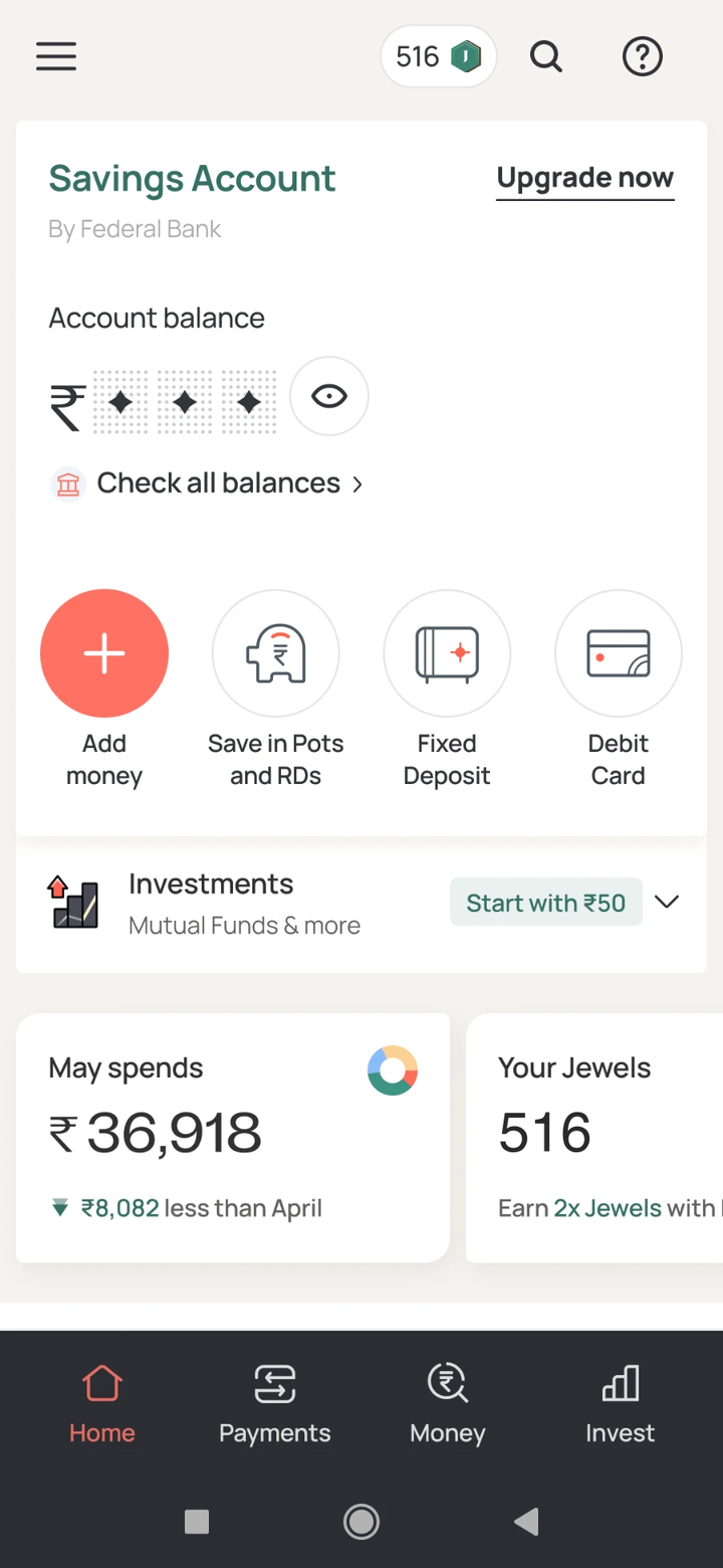
  1. Jupiter home screen with the savings account card and core actions first, and the spends and Jewels widgets below them

    01

    Cards placed below core actions to preserve their prominence, but they still pushed payment actions further down the screen

  2. 02

    Cards moved to the top for quick visibility, but this crowded the first fold with information that wasn't always relevant

  3. Jupiter home screen with Satvika's weekly recommendations: one card at a time, 1 of 3, suggesting a Pot for Swiggy spends, above the savings account

    03

    Recommendations condensed into a single card, one at a time, above the account

  4. Jupiter home screen with Akshat's Weekly Recap: a carousel of insight cards with a refresh timer, such as peers in your income bracket typically invest 80,000

    04

    A weekly recap with its own space and a refresh timer, set apart from the account

Identifying an appropriate real-estate

If not the home screen, then where?

Since the goal was to create a customisable space, the widgets needed a dedicated home. Adding a whole tab was our next ambitious idea. In a finance app, this was a significant ask, but we found a way to make it work without taking anything away from existing users. Loan-rejected users turned out to be the answer: strong users declined for reasons unrelated to their value to Jupiter, who had an entire tab sitting unused. This gave MySpace a real surface without disrupting anyone's experience


Nav today Jupiter's bottom navigation today: Home, Payments, Money, Invest and Loans
With MySpace The same navigation with MySpace in the middle slot: Home, Payments, MySpace, Money and Invest

The building blocks of MySpace

A modular widget system designed to scale across products

We built a foundational set of modular widgets with interchangeable components, creating a plug-and-play system that minimised engineering effort while allowing the library to scale across diverse use cases
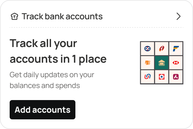
  • Balances widget, empty state: “Track all your accounts in 1 place”, with an Add accounts button.
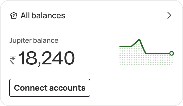
    Balances widget showing only the Jupiter balance of ₹18,240, prompting the user to connect other accounts.
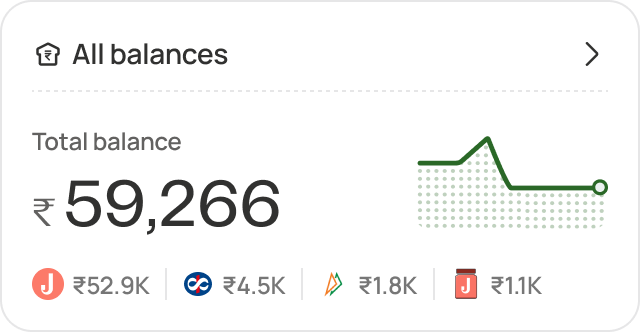
    Balances widget showing a combined balance of ₹59,266 broken down across four connected accounts.
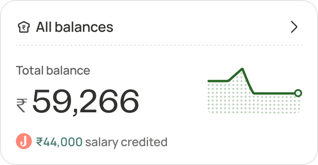
    Balances widget showing ₹59,266 with a ₹44,000 salary credit called out beneath it.
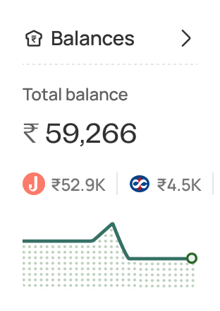
    Compact square version of the Balances widget, showing ₹59,266 and a balance trend line.
  • Net worth widget, empty state: “What’s your true Net Worth?”, with a Track net worth button.
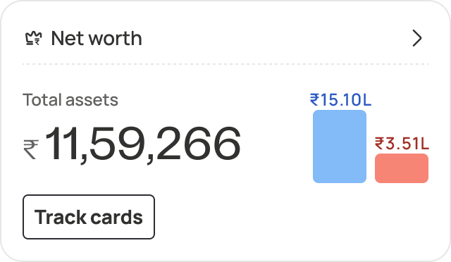
    Net worth widget showing total assets of ₹11,59,266 against assets and liabilities bars, with a Track cards button.
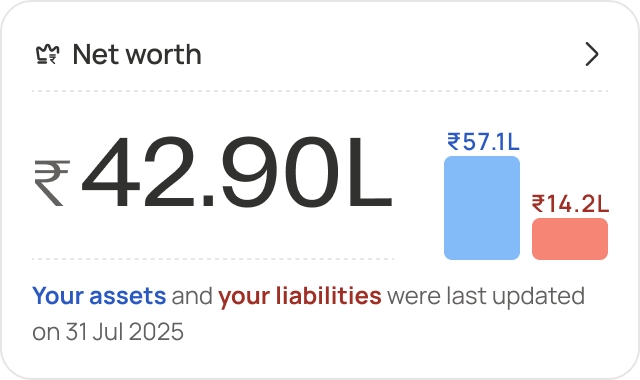
    Net worth widget showing a net figure of ₹42.90L from ₹57.1L of assets and ₹14.2L of liabilities.
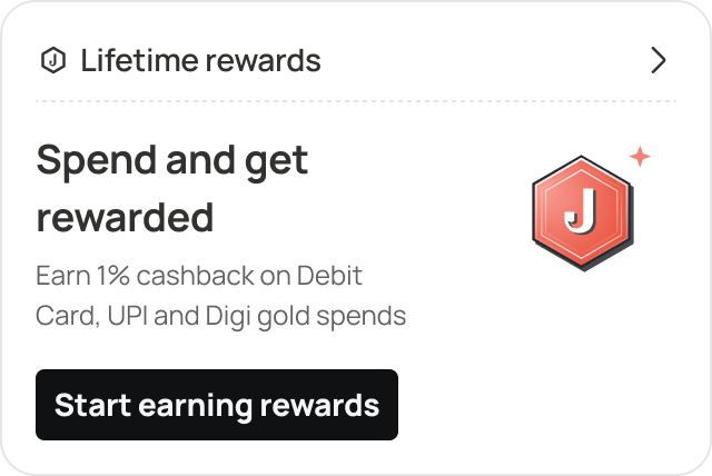
  • Lifetime rewards widget, empty state: “Spend and get rewarded”, with a Start earning rewards button.
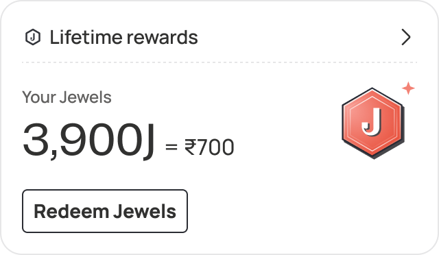
    Lifetime rewards widget showing a balance of 3,900 Jewels worth ₹700, with a Redeem Jewels button.
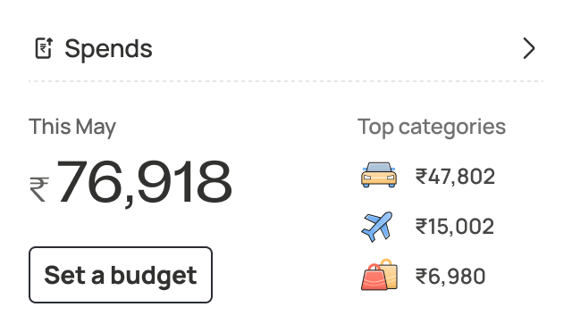
  • Spends widget showing ₹76,918 spent this May and top categories, with a Set a budget button.
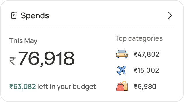
    Spends widget showing ₹76,918 spent with ₹63,082 still left in the budget.
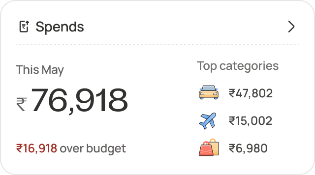
    Spends widget showing ₹76,918 spent, flagged as ₹16,918 over budget.
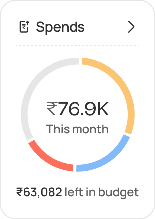
    Compact square version of the Spends widget, showing ₹76.9K this month as a category donut.

MySpace onboarding flow
  1. The Jupiter home screen, with My Space added as the middle tab of the bottom navigation bar
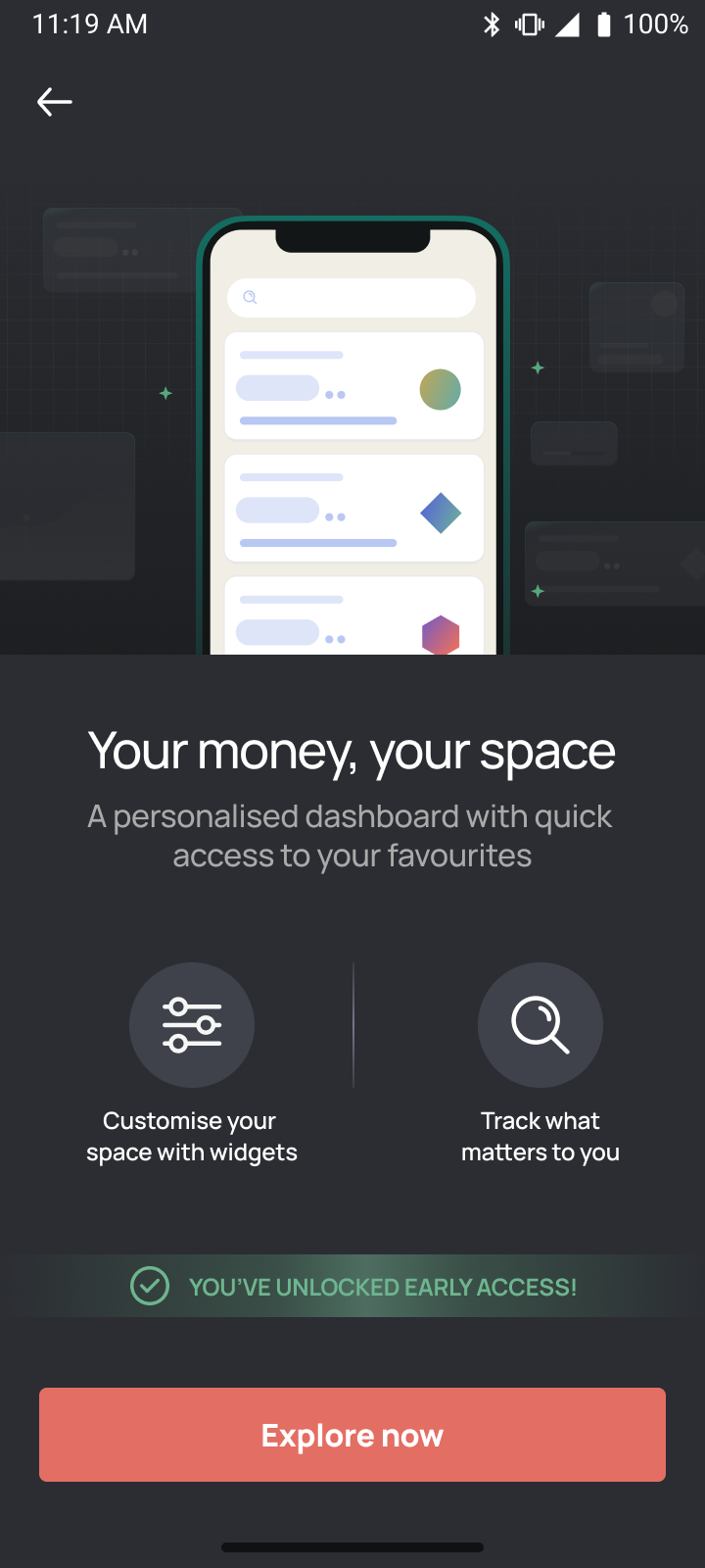
  2. The My Space value-proposition screen: a phone showing the customisable dashboard, headed Your money, your space
  3. My Space: Shriya's Space, your money at a glance, with Spends, All balances and Net worth widgets Lifetime rewards widget: 3,900 Jewels, worth 700 rupees, with a Redeem Jewels button
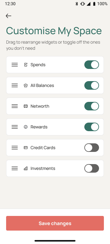
  4. The My Space customisation screen: Make MySpace truly yours, with six widgets that can be reordered or switched off
What it unlocked

The experiment's engagement numbers are what made the full home screen redesign fundable. These are the targets that redesign set, on the strength of what MySpace had already shown was reachable

30% target click-through on lifecycle widgets, a surface with no prior benchmark until MySpace ran
1.43 products adopted per user in the first 90 days, up from 1.14
35% first month retention target, up from 22%
Jupiter app icon

Thanks for watching

Next project Back to work