
Redesigning onboarding to add $2.4M in deposits
Jupiter.Money is an 🇮🇳 Indian fintech and digital banking platform serving over 3 million customers, with a valuation of $600 million
What did I do?
- End-to-end ownership
- User research
- Impact modelling
- Stakeholder alignment
- Journey mapping
- Competitive benchmarking
- Interaction design
- UX writing
- Usability testing

Prologue
Jupiter had evolved from a wallet to a full stack finance app
A space-themed savings account, largely used as an expense wallet
Students and youngsters, tracking daily spends
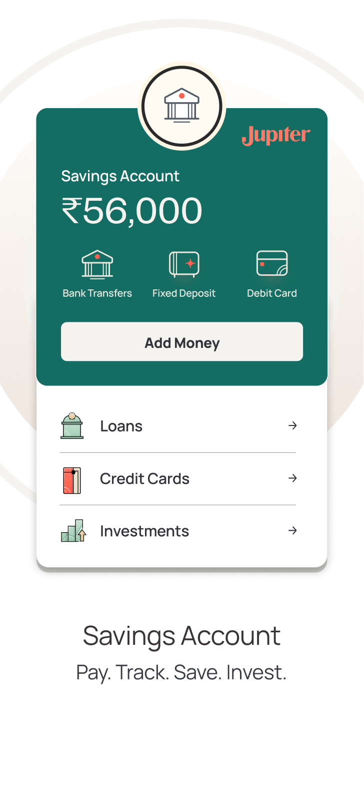
Added an entire line of banking products like Loans, Credit Cards, Investments
Financially mature with higher disposable incomes
The ask
Optimise the onboarding funnel to improve conversion
Since the uber goal was improving M1 retention, and my hunch was that this alone would not be enough. High Savings Account rejection rates and low M1 activation were indicators of a deeper problem. So I ran a few quick studies to test my hypothesis.
-
ICP interviews
"I thought Jupiter was more like a wallet for tracking spends"
ICP match, never used Jupiter -
Cold calls
"I wasn't really sure what I was signing up for."
Recent onboarder -
Usability tests
"Why do you need my PAN and Aadhaar? I just wanted to see my expenses."
Live walkthrough
From funnel optimisation to a company wide big bet
The evidence gave us a bigger opportunity
The initial research findings and our projected business impact downstream helped broaden the scope from conversion optimisation to the wider onboarding redesign. With product, engineering and marketing aligned, onboarding became a company-level priority for the quarter
We reshaped the journey around the user's mental model
High dropoff points Lower dropoff points
Behind the scenes
Understanding users everyday lives beyond Jupiter
Spectrums highlight the range of temporary or permanent challenges of a person
- Spatial context
- Technological context
- Familiarity with financial apps
- Cognitive ability
- Language & Literacy
- Financial capacity
- Security, Trust, Privacy
- Intrinsic motivation
- Comprehension
Situations are temporary challenges that might affect a person
- Environment & surroundings
- Security and trust sensitive
- Connectivity & bandwidth
- Time sensitivity
- Document readyness
- Error encounters
- Temperament
- Availability
- Downtimes

"Everyone around me seems to have it all figured out. Meanwhile, I don't know how to start saving or where to invest."
Financial goals
- Spend smartly — covers wants and needs while still saving for aspirational goals
- Spending awareness — wants to know where his money goes each month
- Investment guidance — asks friends and parents where and how much to invest
- App expectations — simple, reliable, trustworthy money tracking
Pain points
- Earning three years, but feels he hasn't saved enough next to his peers
- Confused and overwhelmed about where to save and how to invest
- Can't tell which platform fits his financial goals best
Trigger to download
- Discovery — sees an Instagram ad about spend tracking and saving
- Decision — downloads the app over lunch, while working from home

"My basic needs are covered, but I want to be financially ready for future expenses while maintaining a comfortable lifestyle."
Financial goals
- Smart savings — plans ahead for milestones like his wedding and buying a car
- Goal-based investing — has some investing experience, now wants it aligned to specific life goals
- App expectations — one app to track savings, investments and expenses, with room to explore loans when needed
Pain points
- Decent savings built up, but worried about growing financial responsibilities toward parents and family
- Confused and overwhelmed about where to save and how to invest
- Can't tell which platform fits his financial goals best
Trigger to download
- Discovery — hears about the app from a colleague who uses Jupiter for investments and mini-loans
- Decision — downloads it one evening after coming back from office
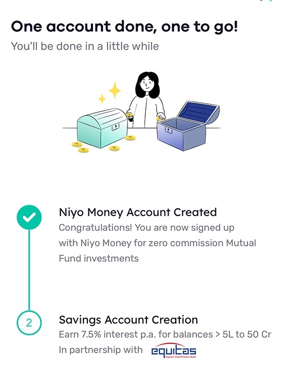
- NiyoXProcess visibility
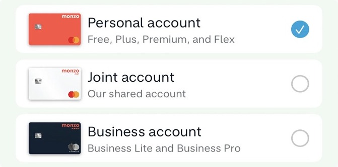
- MonzoClutter-free selection
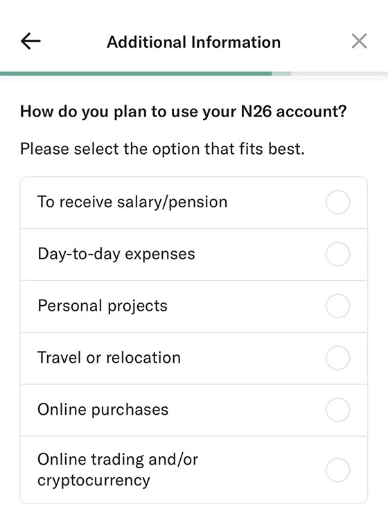
- N26Intent-based personalisation
- FiVisual priming
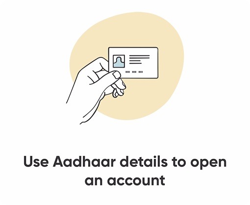
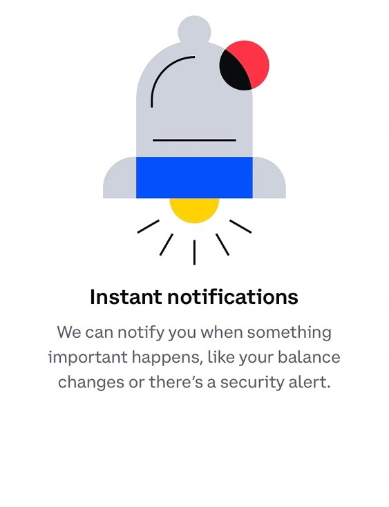
- CoinbaseBenefit-first permissions
- Pediatric waiting roomsCalming design

- NoomTrust via tone and social proof

- Festival signageGlanceable comprehension

Three recurring problems gave us three principles to design around
-
01
Problem
Expectation mismatch
The flow felt too long for what users thought Jupiter was
PrinciplePrioritise
transparency -
02
Problem
No trust
PAN and Aadhaar felt disproportionate to the value users understood they were getting
PrincipleEstablish
credibility -
03
Problem
Missed cross-sell
Onboarding didn't help users discover Jupiter's broader product ecosystem
PrincipleProvide guidance with
cross-sell
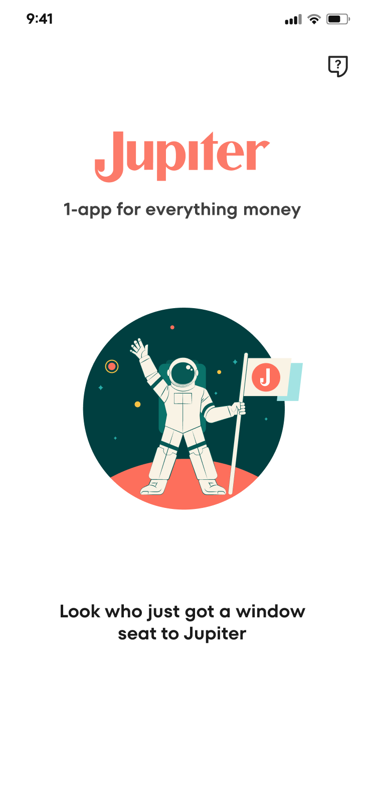
Splash
Making the first impression count
An unclear value proposition followed by an immediate ask to act, before users knew what Jupiter was
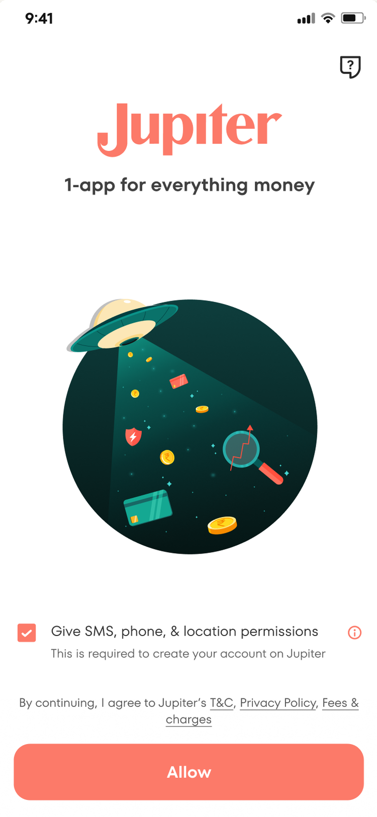
Starting with a warm welcome that seamlessly led users into the journey, removing an unnecessary tap
Mobile number
Setting the right expectations from the start
Asking for permission without sharing the reason or benefit
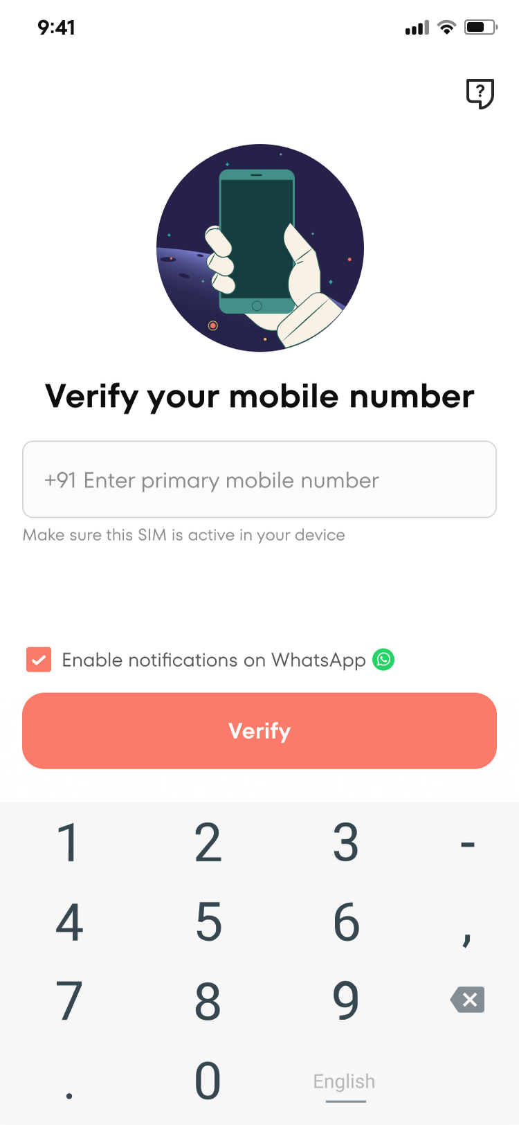

Combining the first step with the value proposition, and making permissions feel useful to the user
Permissions
Making permissions feel purposeful
Multiple permission asks felt overwhelming and alarming this early in the journey
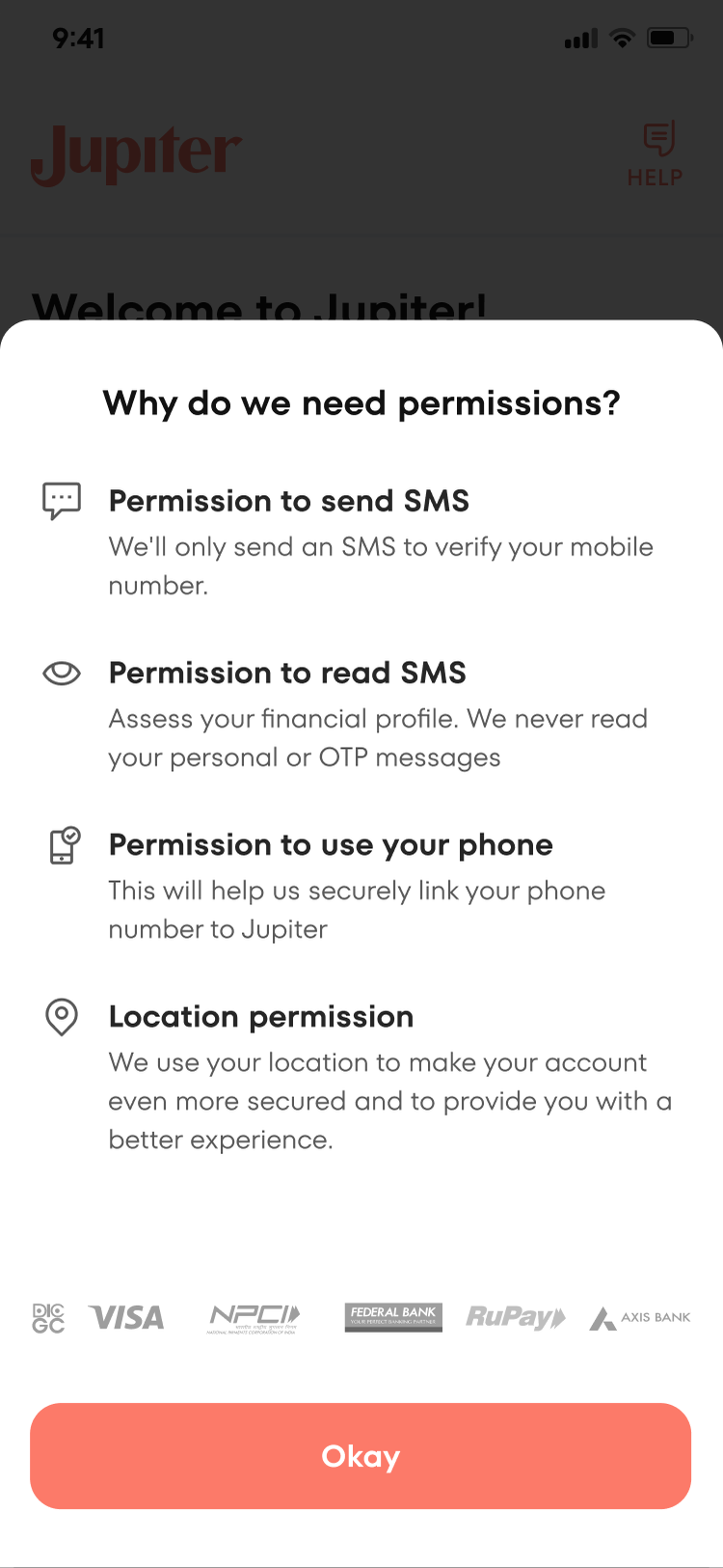
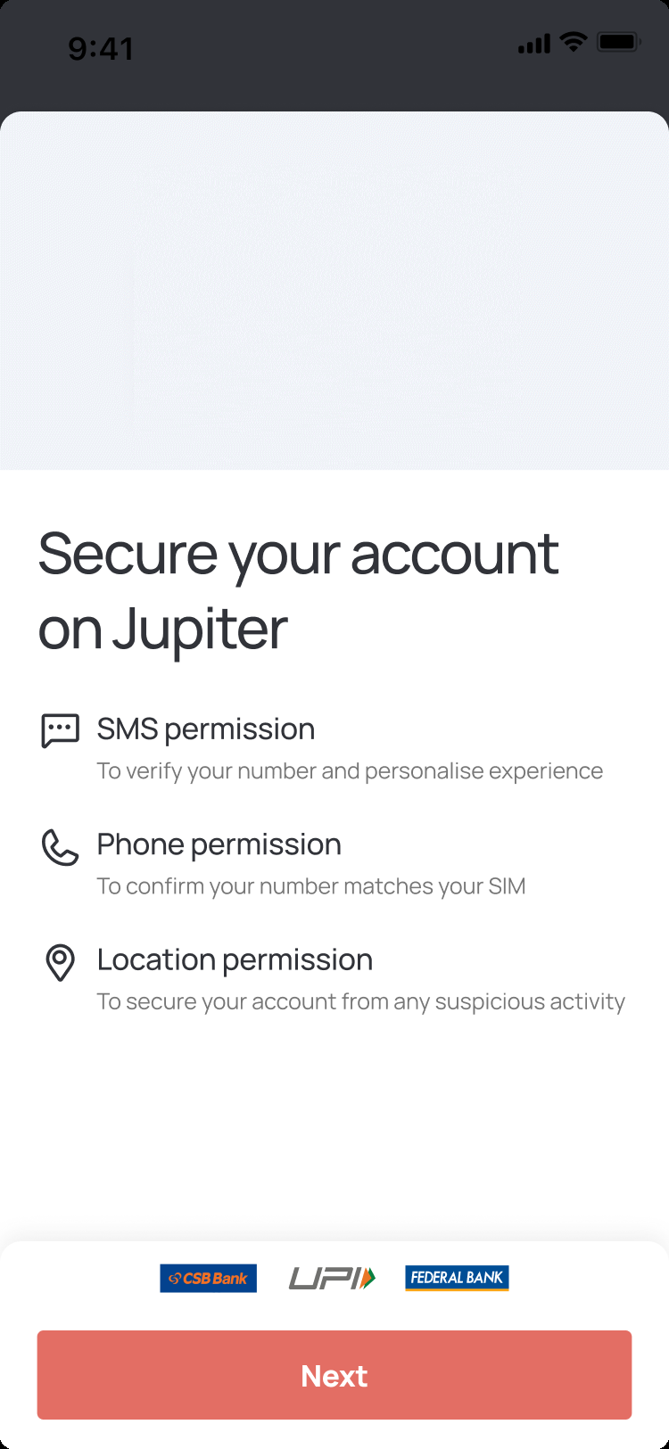
Transparency put users at ease, while visual priming showed them what came next
Loaders
Using waiting time to build confidence
Random facts filled the wait, but gave users little reason to care


Contextual visuals and social proof turned the wait into a moment to build trust and awareness
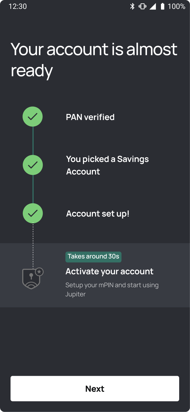
Process Map
Making the journey visible from the start
This new addition brought more transparency to the onboarding, helping users understand what was ahead and track their progress










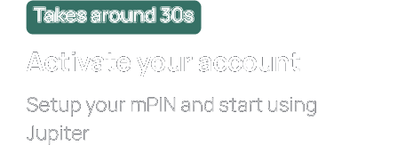




















Realistic time estimates, clear steps, upcoming document requirements, and progress celebrated
PAN
Addressing the concern behind PAN drop-offs
30% drop-off as users worried sharing their PAN could impact their credit score
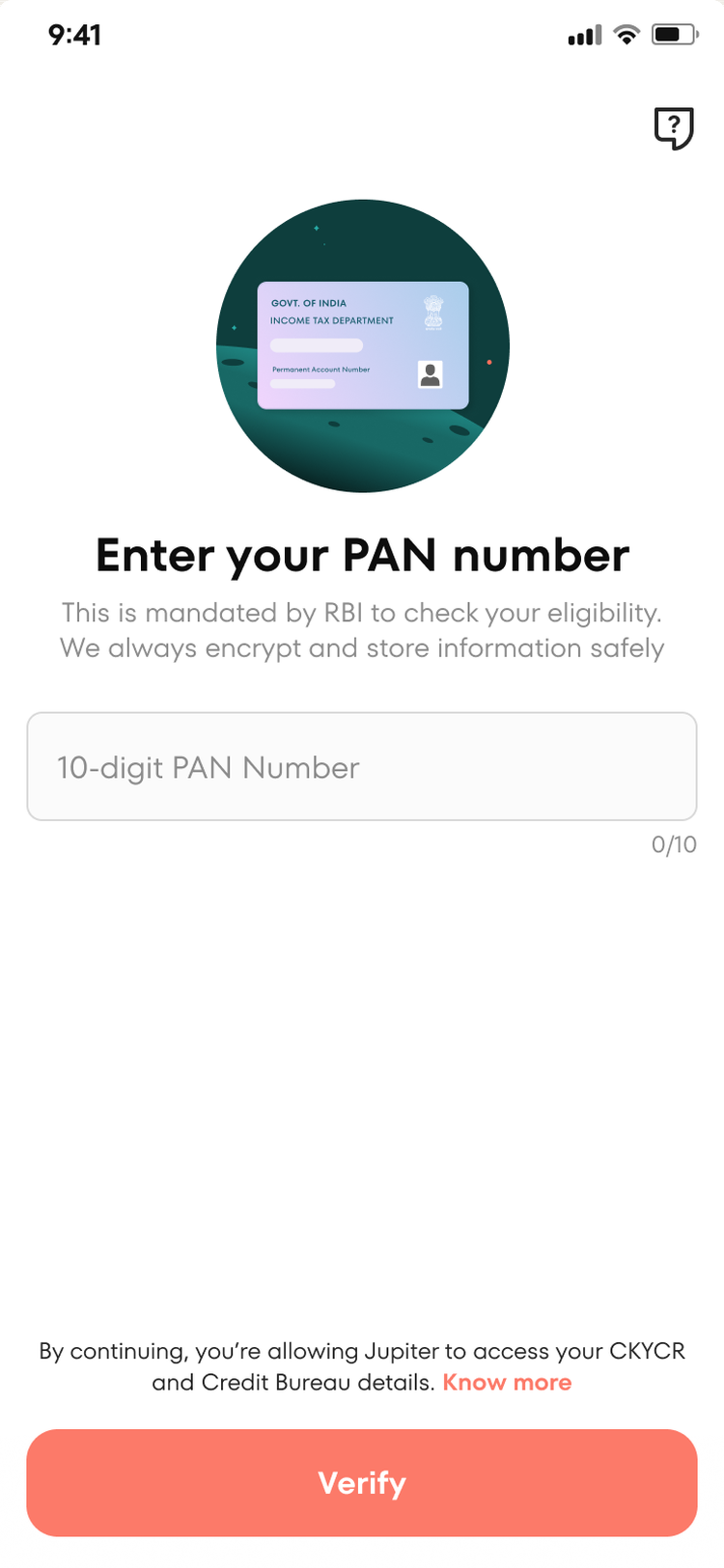
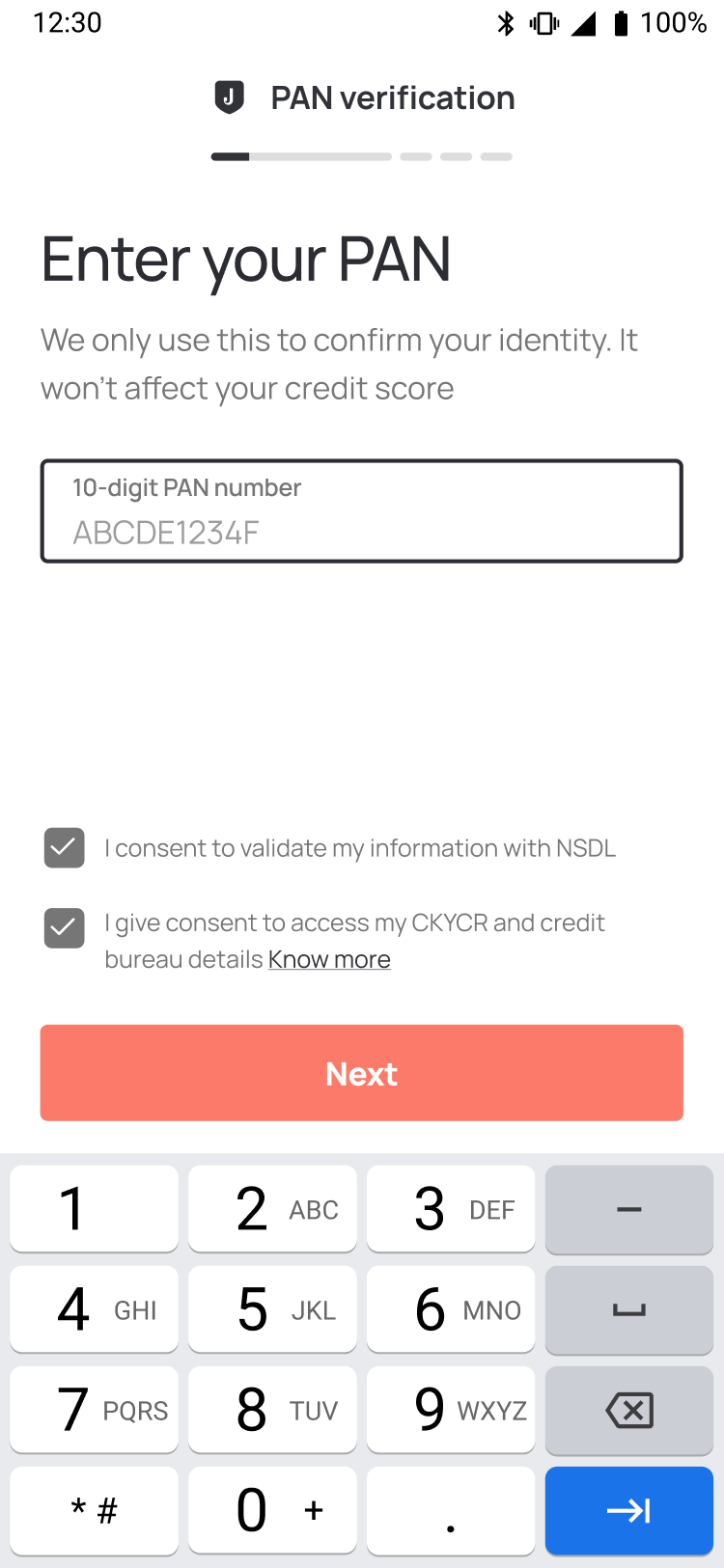
Addressing the credit-score concern directly helped halve PAN verification drop-offs
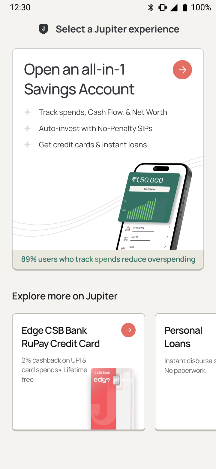
Product selection
Helping users choose the right product, faster
Better user underwriting enabled Jupiter to make smarter, more relevant product recommendations, reducing the cognitive load of choosing between multiple products
- Scale for 3-6 products
- Dynamic state-handling
- First fold optimisation
Overloaded with text and numbers
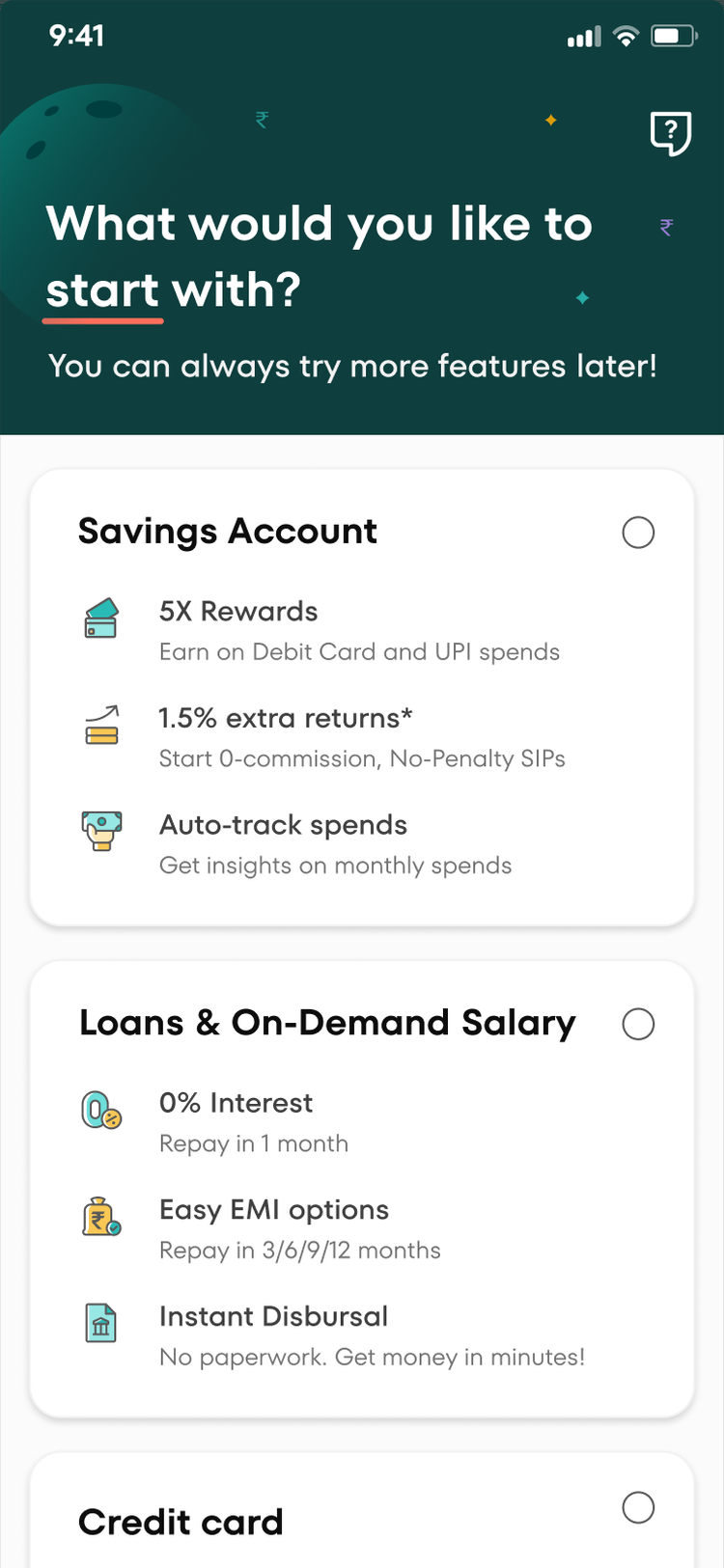

Strong product recommendation with ease for browsing more products. Actionable headings, supporting visuals, social proof, and backend control over card order
Iterations
A product selection system built to evolve with Jupiter
Product selection had to balance Jupiter's evolving product strategy with users' need to make a confident choice. We explored three strategic hypotheses, spanning user control to system intelligence, to find the right model
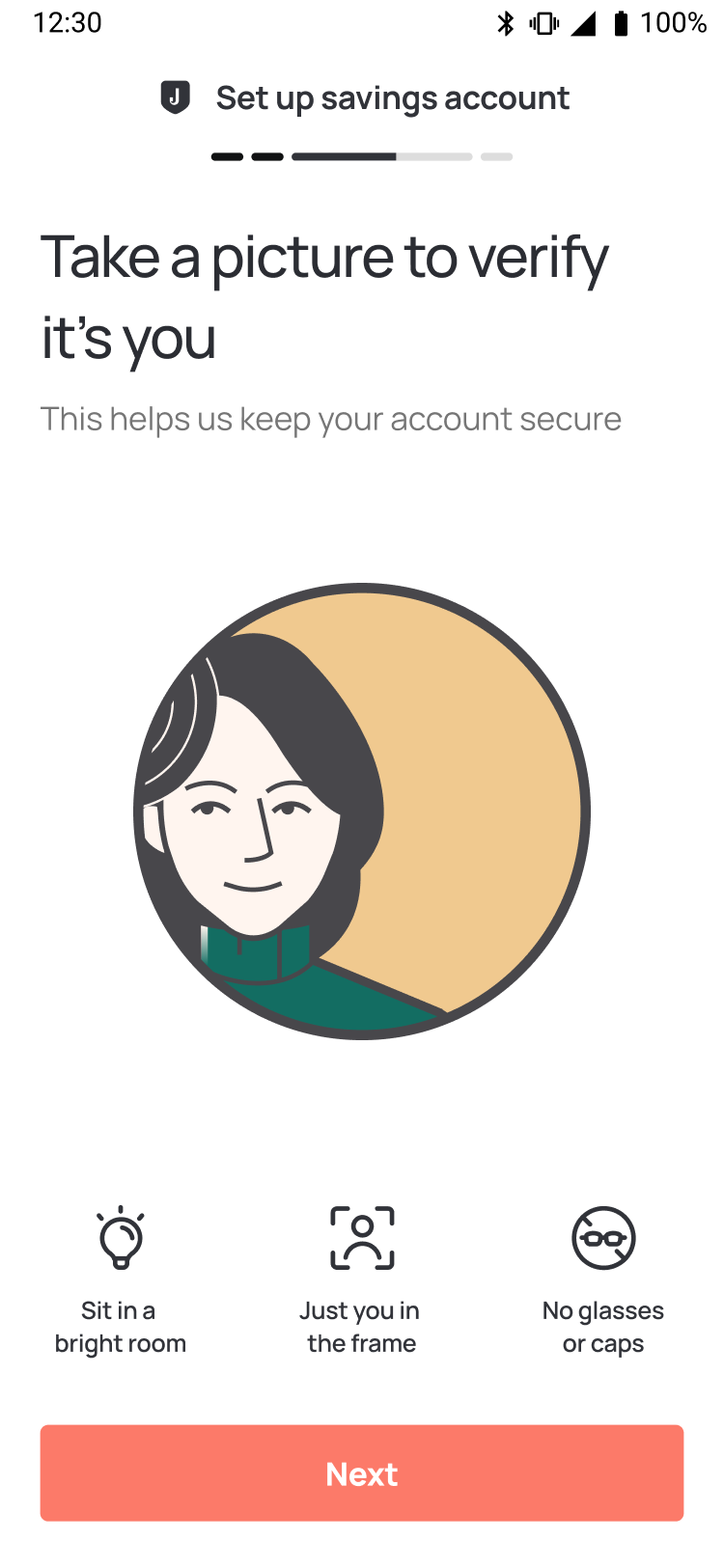
Selfie check
Removing the self-consciousness from verification
“Selfie” made users self-conscious and unsure how their photo would be used


A clear purpose and guided instructions made the step feel simple and reassuring
Error handling
Turning a dead end into a next step
Playful, quirky metaphors made an already frustrating rejection feel more frustrating






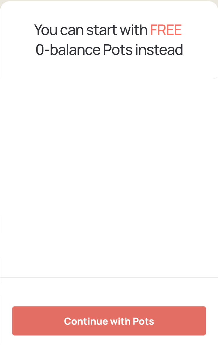
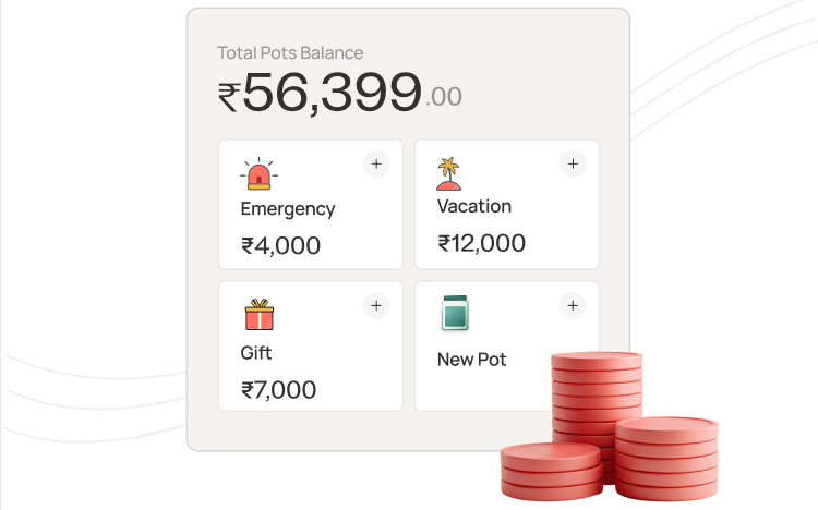



Gracefully handling the rejection with a personalised alternative path forward
How I'd approach this today
-
01
Research Granola · NotebookLM
Transcribe and synthesise interviews faster, surface patterns across conversations, and use AI to challenge my initial assumptions
-
02
Explore + Prototype Claude · Figma MCP
Go straight to high-fidelity, working prototypes and explore multiple visual directions in the time it once took to make one
-
03
Motion Claude Code · Three.js
Push motion much further to explore how transitions and interaction can shape the visual experience, not just decorate it
-
04
Test + Iterate Claude
Put real prototypes in front of users earlier, then use AI to speed up synthesis and iteration while keeping the judgement human
What came next
-
01
A new entry point
We experimented with an alternative app entry via TPAP, letting users link their mobile number and start making payments from an existing bank account through Jupiter. The home screen then became an opportunity to discover and cross-sell other products
-
02
Still evolving
We also tested a browse-first home screen for another user segment. Early numbers were weaker, so we stayed product-led while continuing to experiment with user-quality segmentation, relevant product routing, and faster load and processing times
Thanks for watching
Next project Back to work